| Print | Close |

Activity

Create your own population pyramid for Australia.


You will use an Excel file to create your own population pyramid for Australia using the data you located.

Excel file for PC users (28 kB doc).

Excel file for Mac users (28 kB doc).

Use your completed population pyramid to answer the questions in this worksheet. (106 kB doc)

Which of these shapes, if any, does your population pyramid most closely resemble?
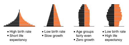
Four population pyramids are shown with dark bars on the left and light on the right of the centre axis. The first has a very wide base and tapers sharply to a point at the top, showing high birth rate and short life expectancy. The second has a wide base and tapers slowly to a narrow apex. It shows low birth rate and slow growth. The third has a moderately wide base and remains parallel until the top quarter where it narrows slightly towards the top. It shows even age groups and zero growth. The fourth pyramid has a moderately wide base and takes a barrel shape, wider at the middle and narrower at the top. It shows low birth rate and high life expectancy.

Use your Excel population pyramid to predict what Australia’s age structure will look like in 2050.


Back to top